Tageslicht App Clip
We are proud to announce that Tageslicht now features a fully functional App Clip.

What's an App Clip you ask?
Well, it is a super quick way to get the App without actually buying it or downloading it in the AppStore. So you can either just point your camera at the App Clip Code, or just surf to this URL.
Why do we think this is great? Because now you can just print out this sheet and put it next to all your AirPlay capable TVs, Projectors or Screens. This way everyone with an iOS device can quickly do a show and tell whenever they want to by just pointing their camera at it.
And little fun fact: As we build this app with native tools, the actual app bundle and clip size you need to download is just 160kb small. Really our smallest app ever. So it just starts up instantly.
We think this is fantastic, and along with the new lock focus and pause and share feature we hope to be of great use in your next presentation desires!
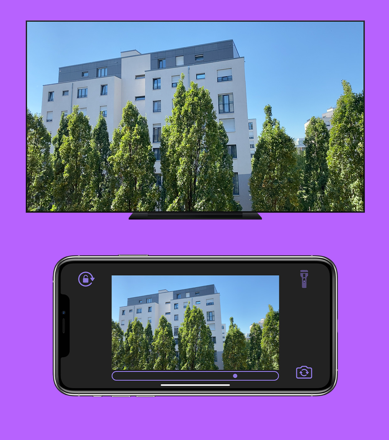
With Tageslicht you have a great experience streaming your camera so it fills the screen, is low latency, and shows exactly what you want it to show. We like special purpose built apps, and we definitely found this area to be lacking one.